
How Being Mindful About Our Learning Styles Creates Movement

Several months ago, I wrote the article How We Learn, and Why it’s Important to Understand. Though I’ve always been interested in and engaged with learning styles, the pandemic has brought the need to consider new ways to continue to learn in a way that fits our particular learning styles even more present for me. And?
Well, I had an insight this week about visual learners, of which, I am one. And, thought about how important it is to ensure that no matter where we are called to work, or what data we are called to work on, that we can all access ideas and tools that can assist our efforts to continue to move ourselves forward.
Alright, so in this 3-minute reflection, I am including three ways that I create opportunities to feed the hyper-visual learner that I am. Ready? Good. Here we go.
1. Print the Data and Display It
Much of the data our team uses is linear. Simply meaning that there is an order to whatever data we are handling, or using, such as step 1, 2, and then, 3. Simple.
Yet, when we are only looking at a set of steps, such as steps 1 through 3, for instance, we may not see how step 3 may be correlated, or, rather, affect step 17. And, it is important that we consider these other possible correlations.
I find great utility in printing and displaying data on an open surface. It allows me to see the data from a different perspective, and gets me away from the computer, which though very helpful, can become limiting. Limiting how? Good question. Here is an example.
The team I work on has many projects going on at the same time, with different leads from different programs. And, just like other team members, I lead my share. Now, with my projects, I will print out an aspect of that project, it may be the latest iteration of some language or numbers I want to consider, and display each one with all of the other projects I’m working on. It looks like this.
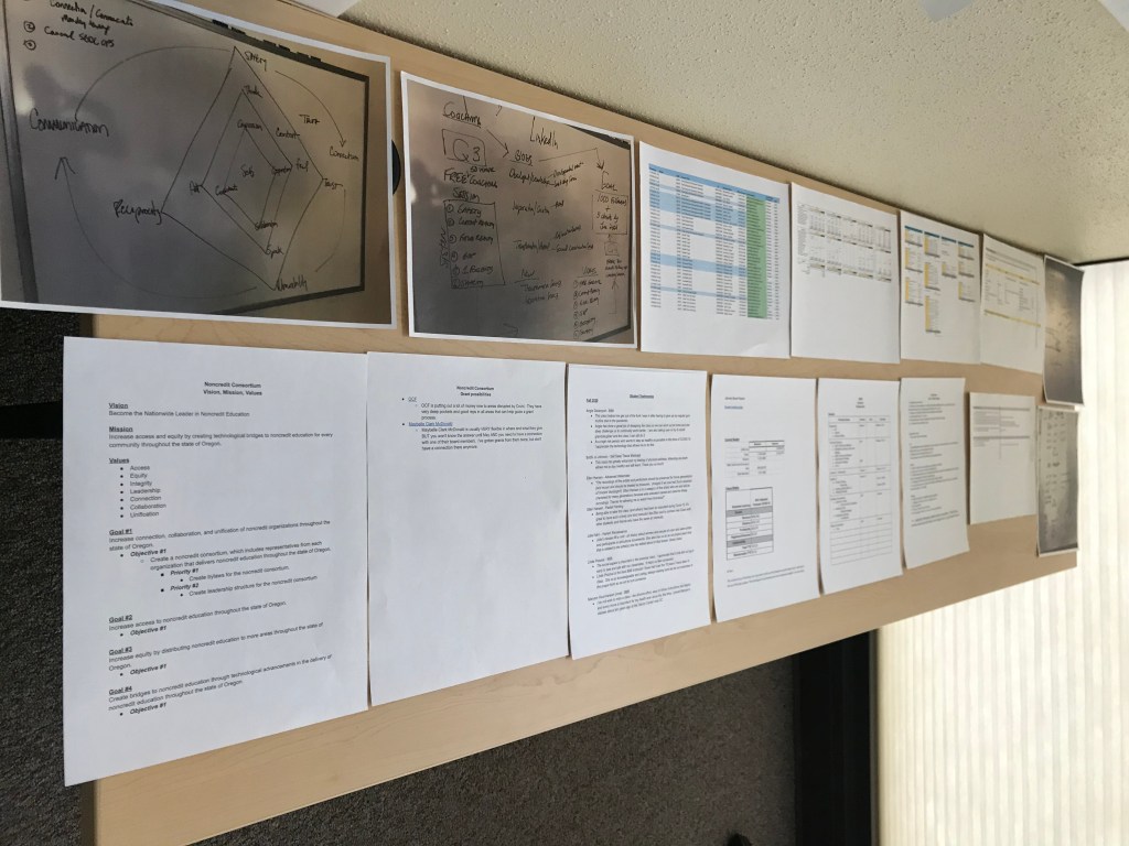
The reason that the printing and displaying technique is so effective is that it also allows me to see across programs, to possible correlations between them. The intersections of which create more synergy and foster new outputs and outcomes for our team. Super fun.
2. Display the Data Differently
Another technique we like to use is to simply display data differently. An example? Sure.
I’ve written previously about the vision we’ve created on this team, and have also written about department-level and individual-level priorities; and, how important it is that individual priorities connect to the department priorities and the larger departmental vision. These connections ensure that everyone is moving in the same direction, and that we are pointed towards our vision.
However, if you simply look at a list of priorities with a vision say as a header to a linear document, there is utility, yet it is rather lackluster. Meaning, we can do better to ensure that people see all of the priorities; and, fully understand how their priorities and the actions that live inside of those priorities are connected to the department.
Here is a very simple visual example of what that looks like.
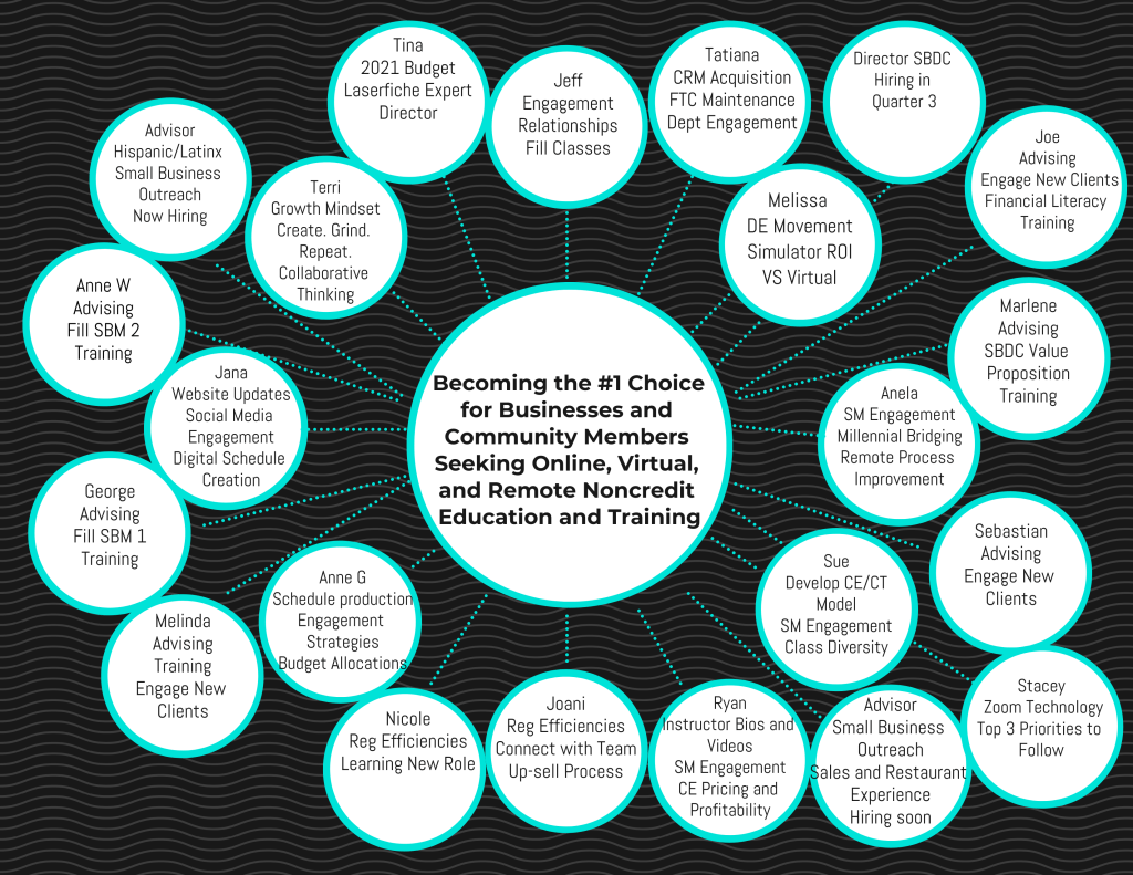
This mind map was created using Venngage, which is a fun tool for taking linear data and making that data visual. Helpful.
These types of visualizations also let people see how their work is connected to their teammates. Especially teammates in other programs they might not see as much. Also helpful.
3. Whiteboards
Of course we’re going to discuss whiteboards, one of my favorite ways to display linear and nonlinear data and information. And, yep, it can go both ways.
Meaning, that you can start with linear data and then create nonlinear ideas and connections, just as you can start with nonlinear data and create a linear system that works for the project you are working on.
Here is an example of a linear and nonlinear whiteboard I did about some future writing I have in mind.
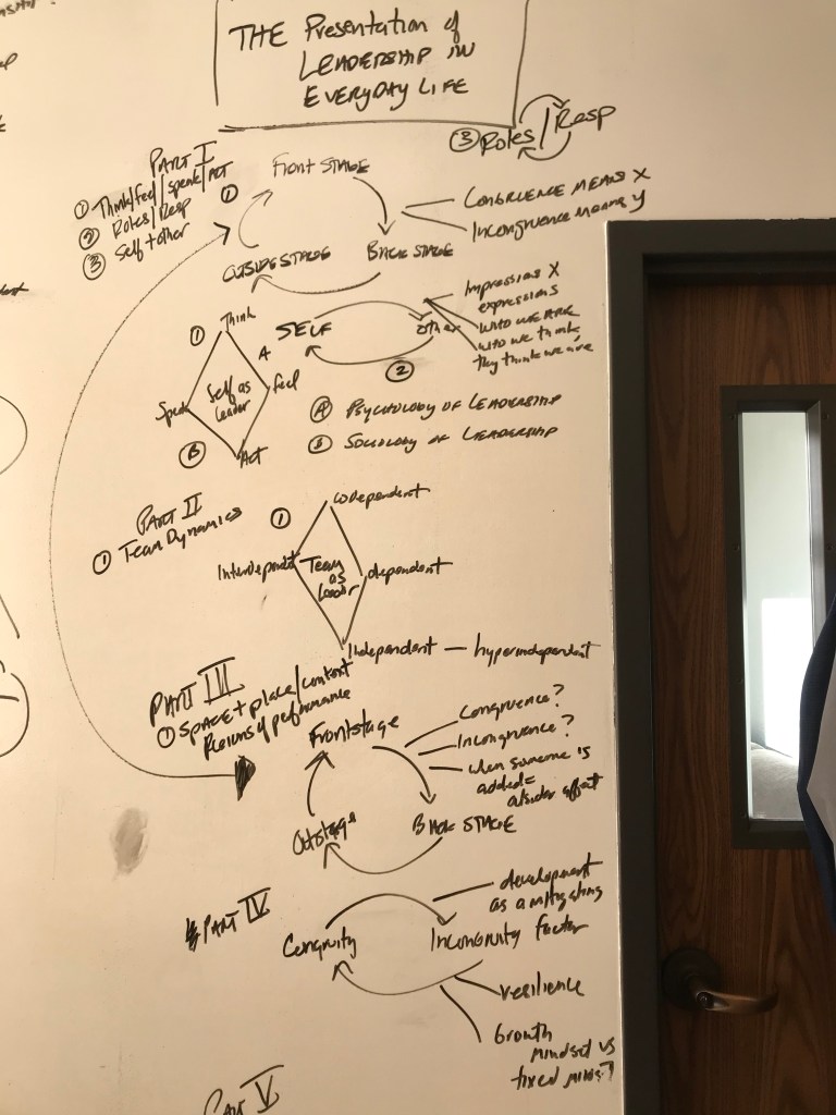
Here you can see the linear thinking in the sectioning off of information by parts, and then the nonlinear, which there is more of, in the variously, and in some ways haphazardly, written constructs and concepts. What am I doing? Good question.
I am getting ideas out of my mind and onto a medium that will allow me to continue to iterate these constructs and concepts for future use. As the work unfolds, there is always something I see differently and learn about, which would have been unavailable to me without working the whiteboard process as I do. Much fun.
How you manage to continue to feed your visual nature matters much less than you create the opportunity to visualize data and information in ways that continue to take your thinking, and that of your teams, further.
When we are mindful about how we learn, we can create all kinds of new possibilities that allow us to step outside of the limitations that are found in very helpful systems, like computer technology.
And, when we do so, we open up new ways to view, think, internalize, and reflect upon these data and information in ways that were previously unavailable to us, which can create more movement for ourselves and our teams.
